Tuesday, 30 November 2010

Yet more new stuff.....

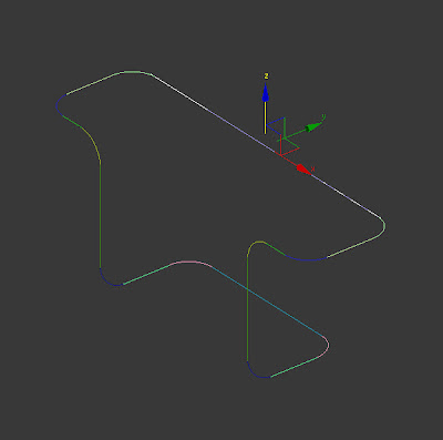
Our animation is based around postcards so I needed to model a display stand to hold them. It would of been tricky to use set 3DsMax shapes so I decided to try the Sweep Tool.
I first sketched spline curves in 3 dimensions....
.

.
Then selected the Sweep Modifier. This sends a set profile along the spline. I then selected a circular profile and set an appropriate radius.
.

.
Once the single postcard holder was modelled, I copied at around at 60 degrees to give cluster of 6.
.

.
The cluster was then copied up 5 times and internal supports added....
.

.
Here's a rough test render showing some cards on display.........
.
For the postcards, we'll be using the Rotoscope technique to animate the imges running animated clips. I hope nobody copies this idea as it's looks really cool :o)
.

Monday, 29 November 2010

More new stuff........

To start the Colchester Zoo clip, I wanted to animate the Action For The Wild logo...........
.
.
I originaly thought about a spinning cube with the logo applied on as material....
.
.
This was ok but to further experiment with new techniques, I wanted to have a go with the Particle System PArray tool. This can be used to explode an Editable Poly.
I used the same cube and linked it to a PArray object.
I selected the following options in the Partical System modifier....
Object Fragments
Number Of Chunks
Viewport Display - Mesh
Picked Emitter
GetMaterial From
Once the options were selected, the timeline slider could be used to view the result.
I changed the settings below to achieve the result I was after......
.

.
Here are some screengrabs of the exploding logo....
.
.
.
.
.
I used a camera with a clipped focal plane to ensure the particals flew completely past the rendered clip.
Here is a screengrab of the cube, partical system and camera in the scene....
.

Tuesday, 23 November 2010

Building Bricks.....

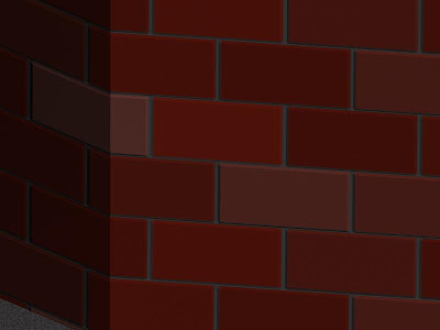
Experimenting with different material and modelling tecniques, I used basic boxes to create the walls in the Tiptree Jam Factory scene then applied some special material....

.


.
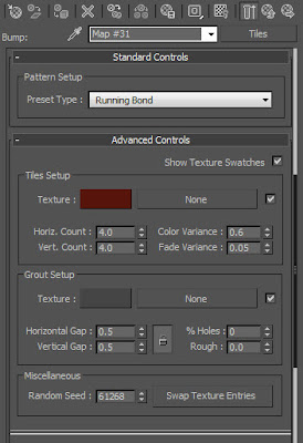
Once this is applied to the materials Diffuse Color Map, It can be copied down to the Bump Map Channel to create 'recesses' where the cement/grout is between the bricks giving a nice brickwork effect...
.
Applying some Noise to the material also helps break up the regular shape.
.

Baby Pygmy Hippo.....

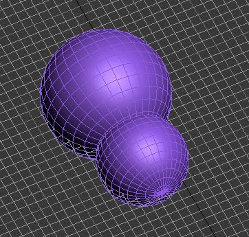
Colchester Zoo has recently bred their pygmy hippos resulting in a dead cute, teeny baby named Ayo. To model her, I started with 2 Spheres which I then trimmed the Polygons from where they were to join to enable me to weld the Vertices together,
.
.
Once welded and converted to an editable poly again, I was able to cut the remaining shape down the centre, add extra polygons by Connected those around the eyes, ears and nose to create some detailed features.
The ears were then extruded out and shaped before being mirrored over using the Symmetry Tool.
.
.
I Unwrap UVW'd the polygons to obtain a mask to export into photoshop to create the 'skin'. For this, I used a combintion of photo's and spray tecniques as few high quality source photo's of Ayo are available.
.
.
I then applied this image to the material of the model
.
.
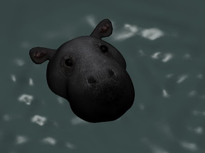
Then I finally made a scene in 3DsMax where the hippo rises from the water, shakes her head then sinks.
This was further enhanced using the Water Reactor and a dummy Sphere Rigid Body which falls onto the water surface. Adjusting the Waters wave settings finally gave a decent representation after much experimentation.
.
.
To enhance the Materials water effect I made it partially transparent, and adjusted the specular settings.
Sadly a couple of days after I finished the model, poor little Ayo passed away, just a few days before her first birthday :o( My condolances go to the Colchester Zoo staff who I know are devastated.

Margay animation....

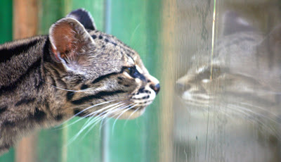
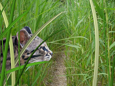
I wanted to experiment with different animation tecniques so in this clip, I used an image of a Margay Cat at Colchester Zoo prowling in some long grasses.
.

.
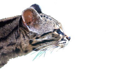
I took the image and Photoshopped out the background......
.

.
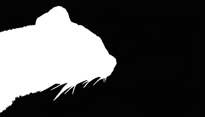
Then created a 'negative'.....
.

.
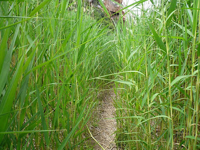
Then sourced a jungle grasses image from the internet.......
.

.
And using the Photoshopped cat image on the Materials channel and the negative version on the Opacity channel, I was able to apply it to a plane with just the cat showing against a transparent background.
This is then animated in amongst some modelled grasses to complete the 3D effect....
.

Monday, 15 November 2010

Jam Factory Updates....

Now that I've researched the building layout a little more, I've been able to press on with the shop exterior. The tiles proved awkward to assign to the material, but Photoshopping an image of similar tiles from the internet gave a decent representation :o)

Sunday, 14 November 2010

Jam Factory Research....

From internet image searches it became clear that I needed more details of the factory/shop layout at Wilkin and Sons in Tiptree so I've been today to get some photo's. Here's just a few of them :o) .....

Wednesday, 10 November 2010

Mosaic....

It's unclear what exhibits will be on display in the VAF at the moment but a Roman mosaic from the castle will housed within the gallery. It was originally discovered on the site of the VAF so it seems an appropriate new home.

Modelling the Jam Factory.....

I'm aiming to concentrate the animation on the reflection of the factory in the Jam Jar but need to model a basic factory building arrangement so that the camera can pan round and see where the jam is produced.

The factory models only need to be basic with not too much detail but at least give a nod to the actual buildings.
I've started with the main entrance buildings, using low poly models and applying basic brick and woodwork materials.
The doors and sign are simple images grabbed from Google and modified in Photoshop.


Update:

Done a little more to the building now. I've added the wall and railings around the outside seating area and constructed a better door.

The door is constructed from basic polygons and I've added another thin box behind it to act as the glass plane.

Material is from the Raytrace/Arch and Design set as follows....

I've altered the settings to achieve good reflection properties but very little transparency as the interior of the building is not detailed.

Monday, 8 November 2010

Jammy goodness........ :o)
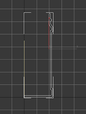
For the Tiptree Jam Factory (Wilkins and Sons) I'm going to try for a strawberry jam jar reflecting the factory. The camera will then pan round to see the buildings (hopefully ;o)

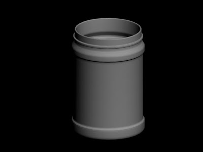
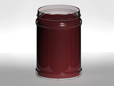
For the jam jar, I sketched a Spline Curve.....


Then revolved it round using the Lathe Tool...


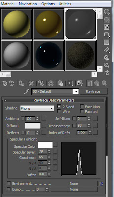
For the glass effect, I set the material type to Raytrace and the settings as follows.....


This gave me a nice see through glass effect.... (At the moment, the 'jam' is just a red cylinder)


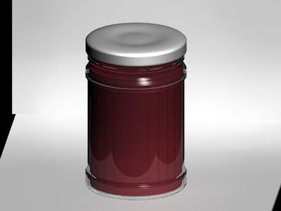
For the lid I used a shaped Cylinder with polygons pushed in and out then Turbosmoothed...


Just need to figure out how to get the label on the jar now ;oD

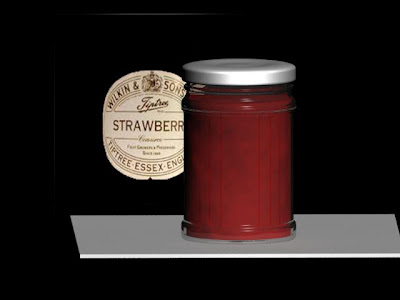
For the 'strawberry jam' I experimented with several different types of material maps before finaly adding a Speckle Map to the Bump channel then set the colour options to different shades of red. It gives a nice jammy effect :o)


Update..... Got the labels on now :o)
The label images were modified in Photoshop then aplied to the Material of a cylinder which is just proud of the glass surface. For the label on the glass, the image had a black and white Mask which was added to the Opacity Channel which sees black as transparent.


Populating the scene.....

I saved a version of the male model and moved a few polygons to create a female version. These were then added to the scene.
By copying (Move and Shift) the people, then changing the colour of the clothes they look less like clones.

.
I scaled some of the people to create children too.
.

Friday, 5 November 2010

Low poly people.....

The scenes looked a bit sterile without scenery and people so I thought I'd model some low poly people.
I started with a basic Box and Extruded Polygons as and when I needed them.


Then once complete, I added a Turbosmooth.
.


Finaly, I added some basic colour Materials. So that the same colourscheme wasn't used over and over in crowd scenes, I've used Created Groups for the Polygons eg: Shirt Group. This way, it'll be easy to select the various elements and change the colour.